Create an Apple TV Poster Parallax Effect in CSS3 & jQuery
Have you seen the new Apple TV parallax effect? It is awesome! We have decided to reproduce this effect using CSS and jQuery, and it looks very close to Apple’s parallax effect.
This tutorial has been created Marius Balaj, and the images have been provided by Konstantine Trundayev and Taras Shypka.


In this tutorial, I will guide you in building something similar to Apple TV parallax effect using CSS, HTML, and jQuery. If you are reading this, I assume you have basic knowledge of the technologies previously mentioned.
Talk is cheap, so let’s start the first part:
With Postcards Email Builder you can create and edit email templates online without any coding skills! Includes more than 100 components to help you create custom emails templates faster than ever before.
Free Email BuilderFree Email TemplatesHTML
Our structure will look something like the following image.
First of all, we need a container div, which we’ll call .poster. Inside our container, we will have five divs (layers) called the following:
<div class="poster">
  <div class="shine"></div>
  <div class="layer-1"></div>
  <div class="layer-2"></div>
  <div class="layer-3"></div>
  <div class="layer-4"></div>
  <div class="layer-5"></div>
</div>
Finally, above all layers, we need a div (.shine), which we will use to add some shine to our poster.
CSS
First of all, let’s make sure that the body has full height by adding the following lines:
body, html { height: 100%; min-height: 100%; }
Let’s style the body a little bit by adding some color:
body { background: linear-gradient(to bottom, #f6f7fc 0%,#d5e1e8 40%); }
In order to 3D rotate .poster, the parent needs to have a set perspective and transform-style. As we can see, the parent of our div is the body itself, so let’s add the following CSS code:
body {
background: linear-gradient(to bottom, #f6f7fc 0%,#d5e1e8 40%);
transform-style: preserve-3d;
transform: perspective(800px);
}
Now, let’s style the card and make it 320×500. We align it to the center of the page, add some rounded corners, and add some shadows:
.poster {
width: 320px;
height: 500px;
position: absolute;
top: 50%; left: 50%;
margin: -250px 0 0 -160px;
border-radius: 5px;
box-shadow: 0 45px 100px rgba(0, 0, 0, 0.4);
overflow:hidden;
}
To center our poster, we need to set its position to absolute, top: 50%, left: 50%, the top margin equal to minus half of its height, and the left margin equal to minus half of its width. Keep in mind that the center of the .poster is the center of the page too.
With Startup App and Slides App you can build unlimited websites using the online website editor which includes ready-made designed and coded elements, templates and themes.
Try Startup App Try Slides AppOther Products
Enough with .poster itself; lets take a look at the layers.
We can select all the layers in CSS with the following attribute selector:
div[class*="layer-"]
So, CSS selects all the divs that have a class containing “layer-“.
Now, we make all the layers absolute. Set the background-repeat to no-repeat, background-position to top left, and the size of the background for layers to 100% width and auto height.
div[class*="layer-"] {
position: absolute;
top: -10px; left: -10px;
right: -10px; bottom: -10px;
background-size: 100% auto;
background-repeat: no-repeat;
background-position: 0 0;
transition:0.1s;
}
Note that the top, left, right, and bottom of the layers are -10px. We are using this to make their size 20px bigger than the .poster size.
We need this in order to not see the edges of the layers when we enable the parallax.
Let’s add the background on each layer.
.layer-1 {
background-image: url('https://designmodo.com/demo/apple-tv-parallax/images/1.png');
}
.layer-2 {
background-image: url('https://designmodo.com/demo/apple-tv-parallax/images/2.png');
}
.layer-3 {
top: 0; bottom: 0;
left: 0; right: 0;
background-image: url('https://designmodo.com/demo/apple-tv-parallax/images/3.png');
}
.layer-4 {
background-image: url('https://designmodo.com/demo/apple-tv-parallax/images/4.png');
}
.layer-5 {
background-image: url('https://designmodo.com/demo/apple-tv-parallax/images/5.png');
}
On .layer-3, we don’t need a bigger size, since we don’t move this layer too much.
JavaScript
Before starting, make sure you have included jQuery above the code you will write next, or you will receive something like $, indicating it is not defined.
The logic of our parallax effect will be like the following. Each time the mouse moves, the .poster transforms: translateY, rotate, and rotateY will change, depending on the cursor position; the farther is the cursor from the top-left corner of the page, the more visible will be the animation.
Our formula is something like this: offsetX = 0.5 – cursor position from top divided by width.
In order to make the values different from the other elements, we will multiply the value received from the cursor formula by a custom value. So let’s get back to our HTML and add some data-offset=“number” to each element where we want to have the animation.
<div data-offset="-2" class="layer-1"></div>
<div class="layer-2"></div>
<div data-offset="1" class="layer-3"></div>
<div data-offset="3" class="layer-4"></div>
<div data-offset="10" class="layer-5"></div>
The same principles apply to the .layers but we will apply them to translateY and translateX.
The bigger the data-offset is, the more visible will be the animation. Feel free to experiment with these values.
For a more readable code, let’s refer to .poster as $poster in our Javascript, .shine as $shine, $layer for all layers, and w and h for the page width and height, respectively.
var $poster = $('.poster'),
$shine = $('.shine'),
$layer = $('div[class*="layer-"]’);
Now, we need to check when the mouse moves and get our cursor position. We can achieve that by using the mousemove event on $(window), which returns as parameter a Javascript object with our position and some other stuff that we do not need right now.
Next, we calculate the offsetX and offsetY with the formula explained above, and then apply our parallax to our .poster and layers.
$(window).on('mousemove', function(e) {
var offsetX = 0.5 - e.pageX / w, /* where e.pageX is our cursor X coordinate */
offsetY = 0.5 - epageY / h,
offsetPoster = $poster.data(‘offset’), /* custom value for animation depth */
transformPoster = 'translateY(' + -offsetX * offsetPoster + 'px) rotateX(' + (-offsetY * offsetPoster) + 'deg) rotateY(' + (offsetX * (offsetPoster * 2)) + ‘deg);

/* apply transform to $poster */
$poster.css('transform', transformPoster);

/* parallax foreach layer */
/* loop thought each layer */
/* get custom parallax value */
/* apply transform */
$layer.each(function() {
var $this = $(this),
offsetLayer = $this.data('offset') || 0, /* get custom parallax value, if element docent have data-offset, then its 0 */
transformLayer = 'translateX(' + offsetX * offsetLayer + 'px) translateY(' + offsetY * offsetLayer + 'px)’;

$this.css('transform', transformLayer);
});
});
Cool, now we have a working parallax widget.
BUT WAIT, THERE’S MORE: The Shine over the Poster
Now, we need to go back to CSS and make the .shine div absolute, add a nice transparent gradient, and set z-index to 100 to make sure that it is over all layers.
.shine {
position: absolute;
top: 0; left: 0; right: 0; bottom: 0;
background: linear-gradient(90deg, rgba(255,255,255,.5) 0%,rgba(255,255,255,0) 60%);
z-index: 100;
}
Now, we have a nice shine over poster, but in order to make it more realistic, the light should follow the cursor as it moves.
How do we do that? Probably you remember the boring 9th grade math classes, when you think you were learning a lot of formulas that you’d never use. Well, we will use some now.
So, the angle of the gradient should be equal to the opposite angle of the triangle formatted by cursor and the center of the poster. (Remember, the center of the poster is the center of the page, so the center is at w/2 and h/2.)
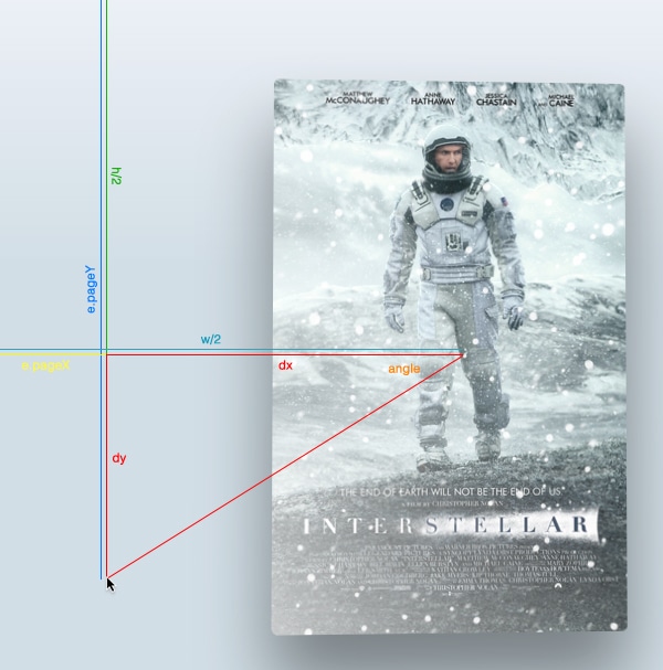
Well, first of all, let’s find the cathetus of the triangle formatted by cursor and the center of the page by subtracting from the cursor coordinates the position of the center of the page.
Then, using the Math.atan2() function, get the angle formatted value. Note that this function returns the value of the angle in radians, so we need to convert for CSS in degrees by using this formula:
angle in radians * 180 / pi = angle in degrees
$(window).on('mousemove', function(e) {
var offsetX = 0.5 - e.pageX / w, /* where e.pageX is our cursor X coordinate */
offsetY = 0.5 - epageY / h,
offsetPoster = $poster.data(‘offset’), /* custom value for animation depth */
transformPoster = 'translateY(' + -offsetX * offsetPoster + 'px) rotateX(' + (-offsetY * offsetPoster) + 'deg) rotateY(' + (offsetX * (offsetPoster * 2)) + ‘deg),
dy = e.pageY - h / 2,
dx = e.pageX - w / 2,
theta = Math.atan2(dy,dx), /* get angle in radians */
angle = theta * 180 / Math.PI; /* convert rad in degrees */

/* apply transform to $poster */
$poster.css('transform', transformPoster);

/* parallax foreach layer */
/* loop thought each layer */
/* get custom parallax value */
/* apply transform */
$layer.each(function() {
var $this = $(this),
offsetLayer = $this.data('offset') || 0, /* get custom parallax value, if element docent have data-offset, then its 0 */
transformLayer = 'translateX(' + offsetX * offsetLayer + 'px) translateY(' + offsetY * offsetLayer + 'px)’;

$this.css('transform', transformLayer);
});
});
If you check the values of the angles, you will see that the values are from -180 to 180. Let’s fix that by adding:
Make the angle values to be from 0-360, not from -180 to 180.
if (angle < 0) {
    angle = angle + 360;
}
Now, we have the angle. Let’s change the value of the angle in the gradient each time we move the cursor:
$shine.css('background', 'linear-gradient(' + (angle - 90) + 'deg, rgba(255,255,255,' + e.pageY / h + ') 0%,rgba(255,255,255,0) 80%)’);
Note: We subtract 90 from the angle because that’s how linear-gradient works. If you use -webkit-linear-gradient or -moz-linear-gradient, there’s no need to subtract.
The tutorial is done! You can take a look at the demo.
Also, I have created the second demo and added some effects just for fun. You can check it here.
I hope this tutorial has been very useful for you. Leave me a comment with your ideas and experiments!


 siter.io
 pulsetic.com
 static.app
 mailpost.io